Apparently, however, the Vancouver Canucks are not of the same mindset as I.
Today was that launch of the new Canucks sweater that I mentioned a while back and there was much hype and pomp and such. Much yammering about how all the players were so excited to be coming back to a new season. About how Vancouver has the greatest hockey fans in the world. About how this new sweater is going to celebrate our past and our present, and blah blah blah. And then 5 of the players skated out onto the ice wearing jerseys that look remarkably like the old ones. As in, with the identical logo, but in a different colour. Oh ya, and this time it says "VANCOUVER" on it.
Here's a pic I snapped of team captain Marcus Naslund in his "new" uniform:

See! It's just the stupid whale, but in the vintage colours! And it says "VANCOUVER" across the chest. And, apparently, they paid over a million dollars for this. Why doesn't anyone pay me a million dollars to not design something new? I'm totally capable of not designing something new!
I did learn, however, that the blue and green colours were originally chosen to symbolize "BC’s natural landscape" - ocean and the forests. So that's something.
Fortunately, before going to the launch of the Canucks so-called "new" jersey, I'd seen this leak, so I knew that there wasn't actually going to be a new look. It helps to lessen the disappointment if you are pre-emptively disappointed. But I still think it was rather ridiculous of the Canucks organization to hype it like it was going to be a new look, when it's really not. I mean, consider how this was presented on their website leading up to the launch:
 Notice how each of the examples given actually have a different logo? The vintage "stick in a box", the "flying V", the "flying skate" and the "stupid orca" (as we true Canucks fans like to refer to each of these logos).... doesn't this lead one to expect that the question mark for 2007 will be filled in with a jersey with a different logo?
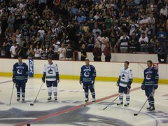
On the plus side, I got to see 5 Canucks players in this underwhelming new outfit:
And John Shorthouse. He does the Canucks radio broadcasts and, since I usually listen to the games on the radio (being the cable-less person that I am), I almost feel like I know him, I've heard his voice so many times.

I bet I'm the only girl in the blogosphere blogging about Shorty.


No comments:
Post a Comment